
Back
Designing a Functional Dashboard for Koach
Streamlining the mentor-matching experience.

Project Results
Website for early career professionals to connect with mentors in their desired field
Koach is a small startup in the early-stage. Koach's goals are to provide a platform where students, entrepreneurs and anyone looking to give or gain insights into their career can connect and find mentors and mentees.
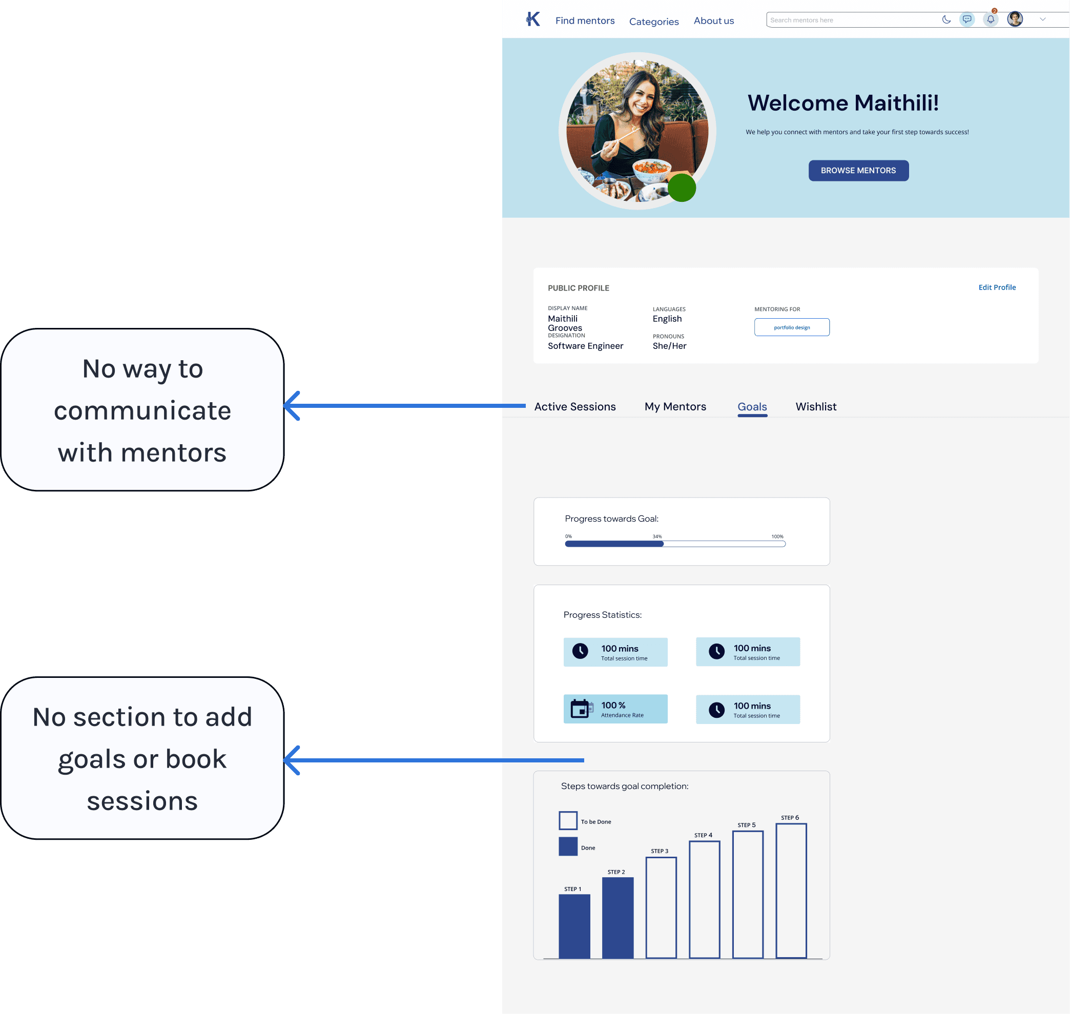
Heuristic Evaluation
In order to evaluate key issues with our current design of the dashboard interface, I collaborated with others on the design team and development team to identify problems using usability heuristics including visibility, flexibility, and user control.
What is the problem?
From the heuristic evaluation, we found issues with the visibility of UI elements that left the following questions unanswered:
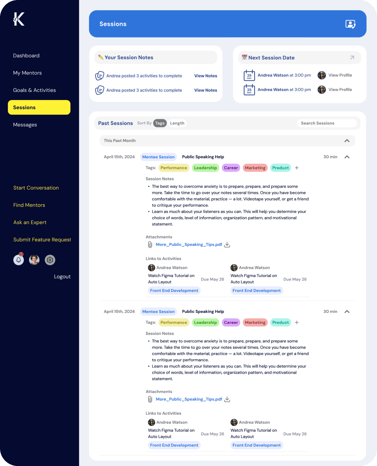
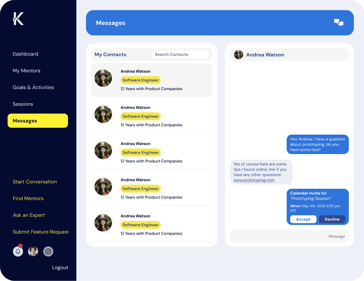
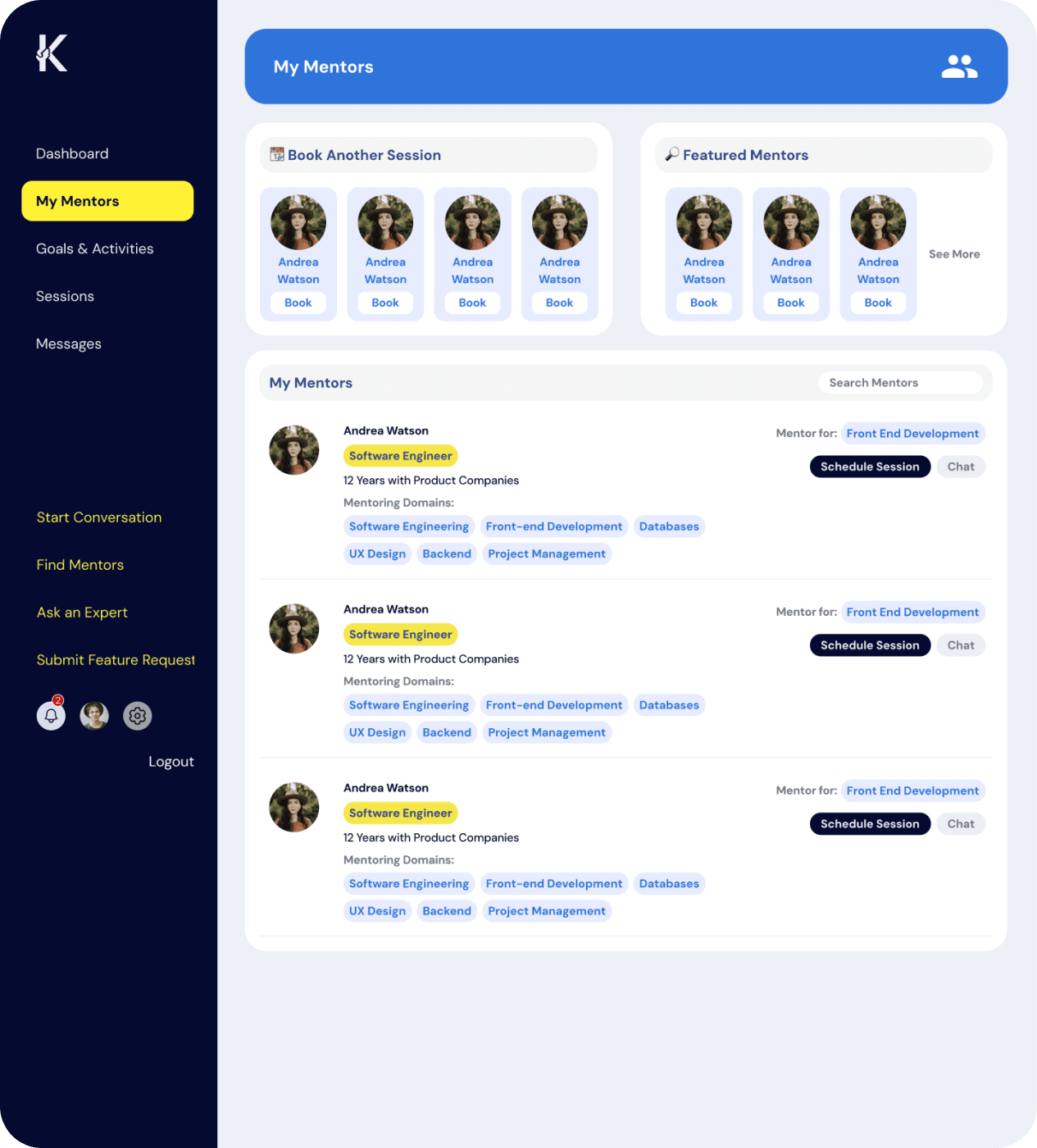
How would users communicate with mentors or mentees?
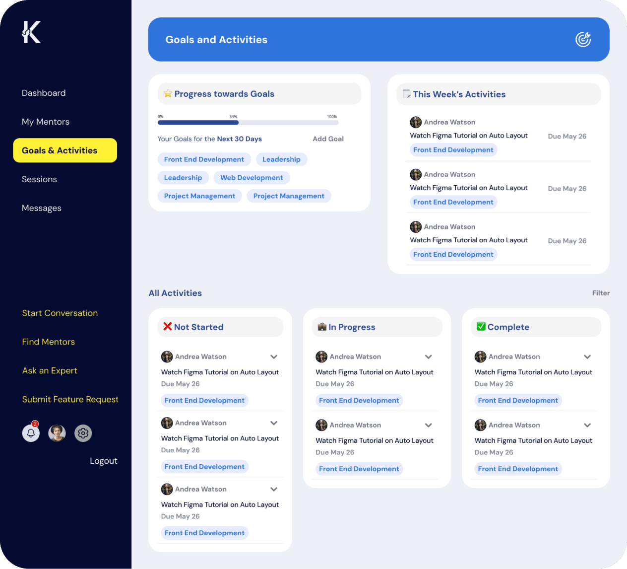
Where could users add their goals and book sessions?
Information Architecture
There was a lack of understanding in how the platform should be organized. To visualize how features like ‘booking sessions’ and and ‘communicating with mentors’ would relate to each other, I created an Information Architecture.
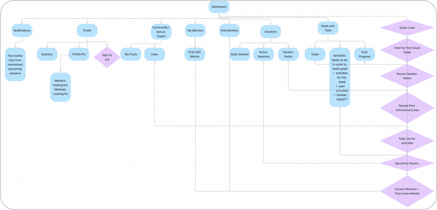
Key pages and features were mapped out in a clear hierarchy to help lay out the platform
Sessions Page > Book Sessions
Goals Page > Add Activities and goals
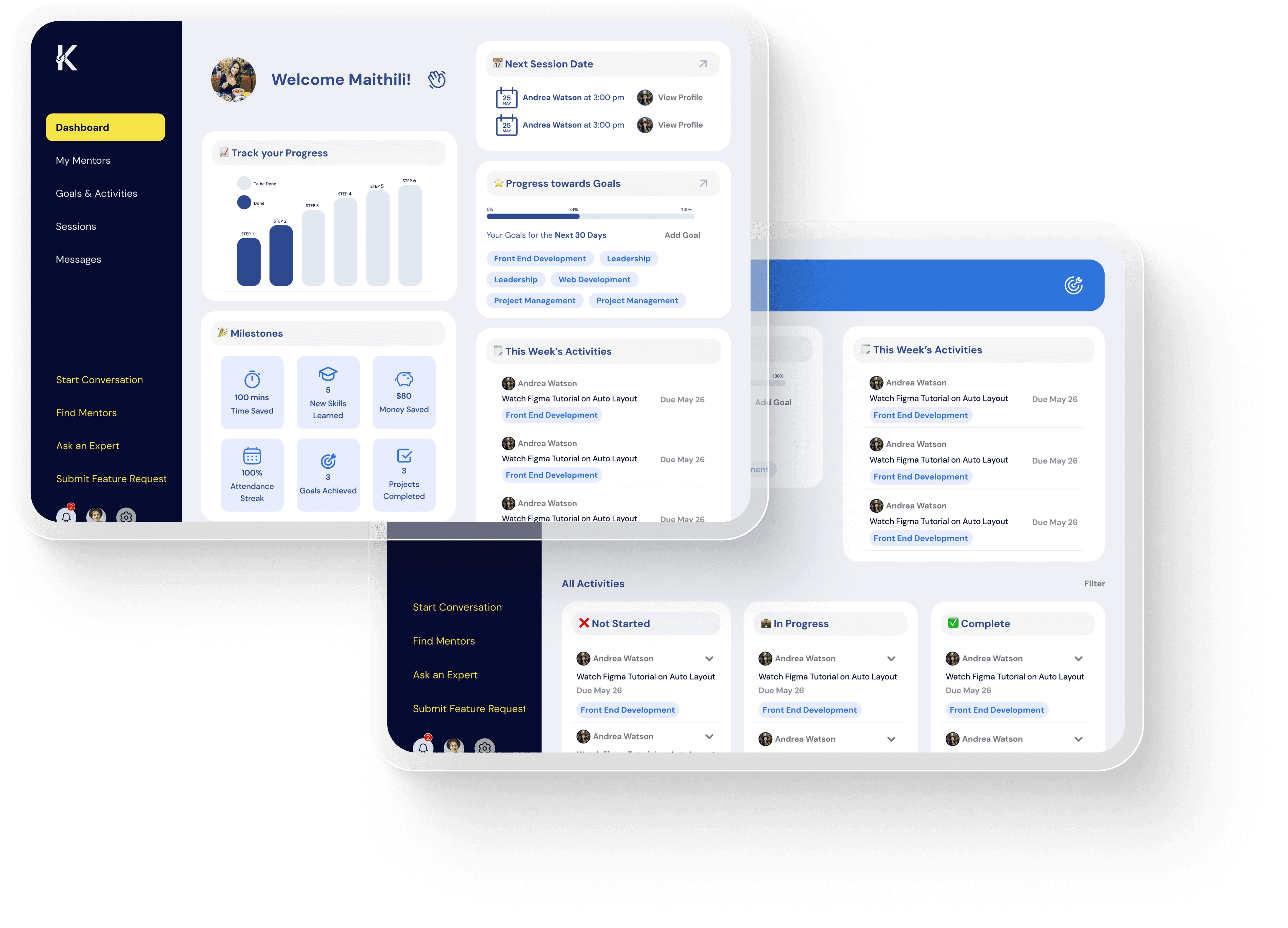
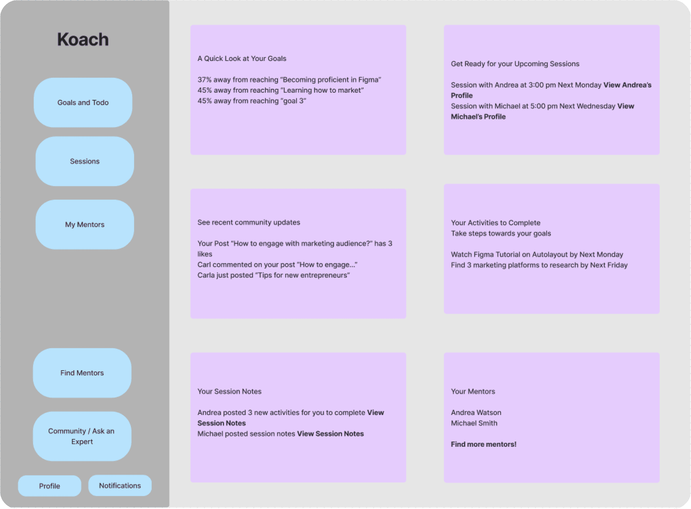
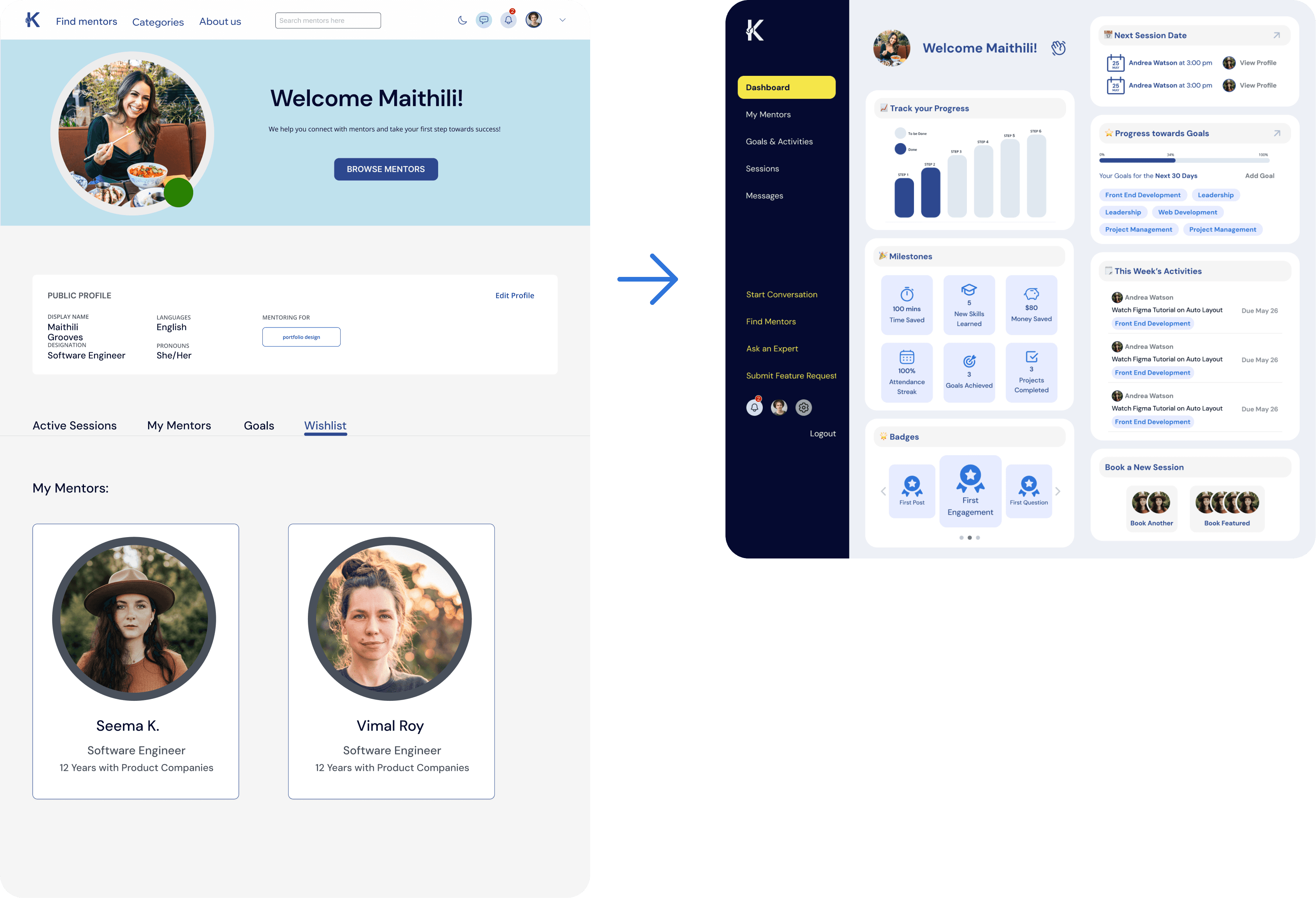
Dashboard Layout
Sidebar Layout: allow for every page to be easily navigable, and all pages to be visible at each part of the website
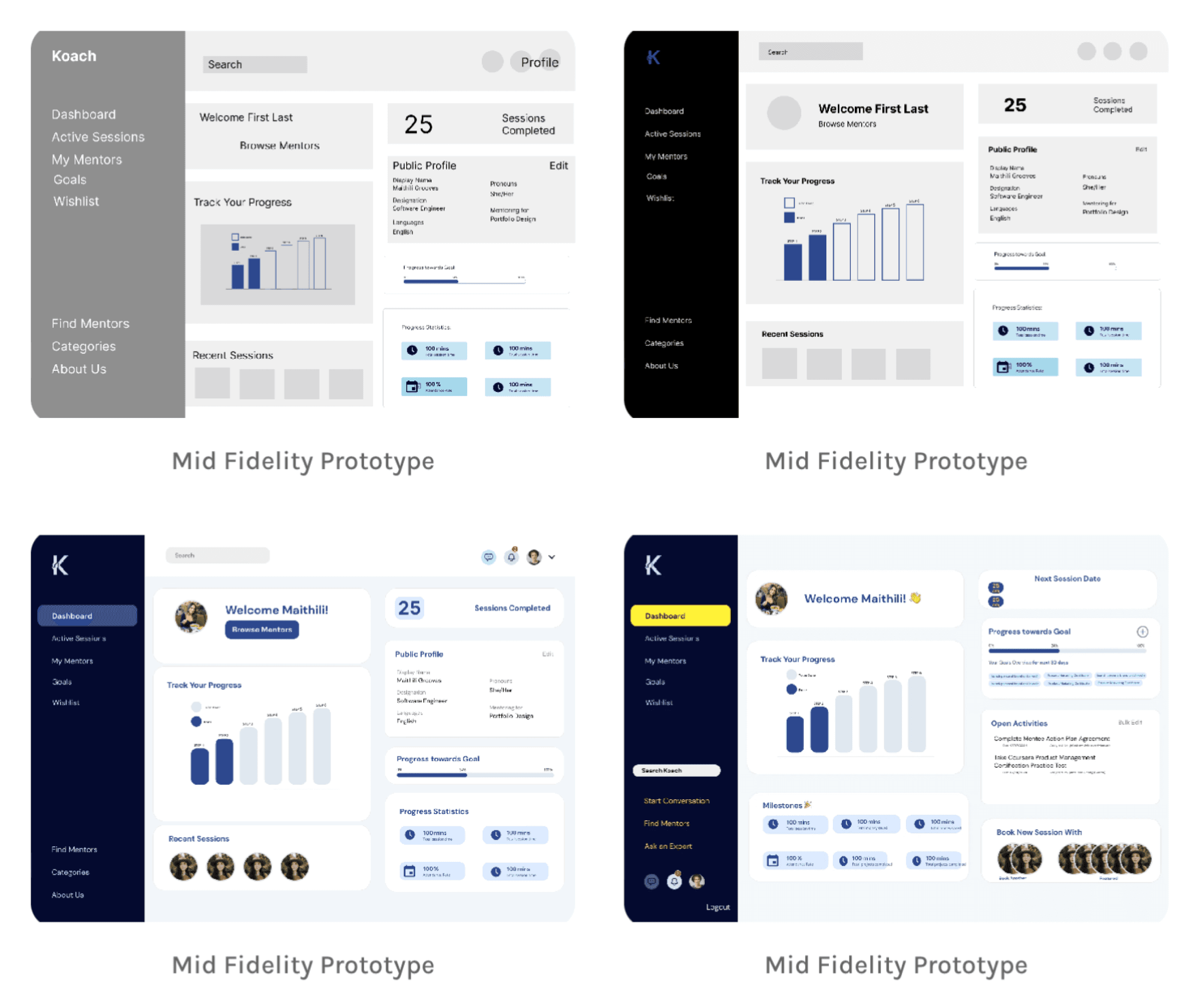
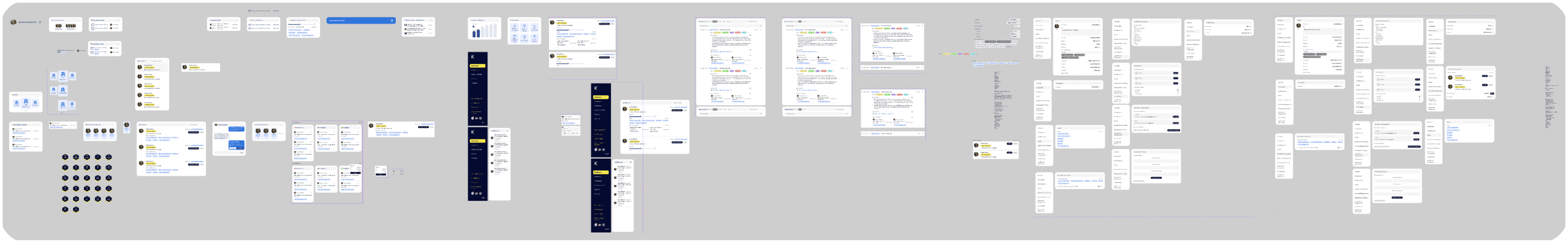
Low to high Fidelity Prototyping
Design Iterations of dashboard
Key features: Session Milestones, Progress towards goals
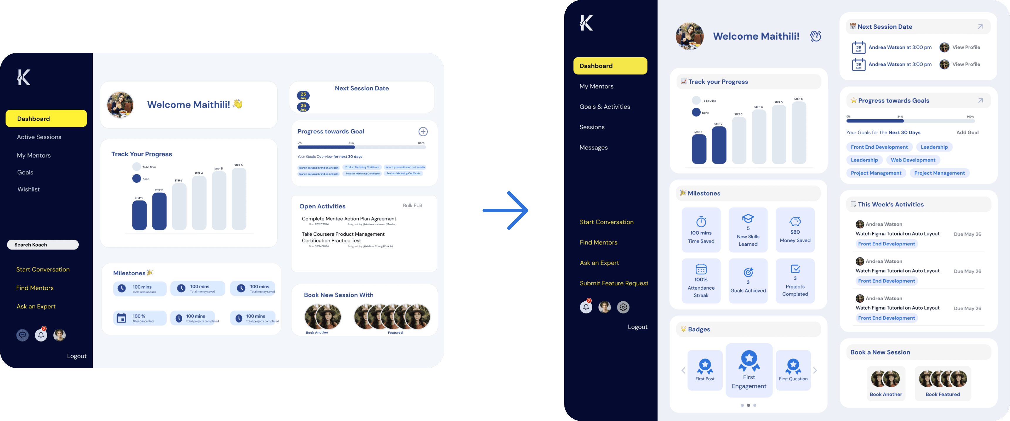
Design Changes
Addition of tags for task type for better user flow from activities to goals page
Greater call to actions: “view profile”, “add goal”
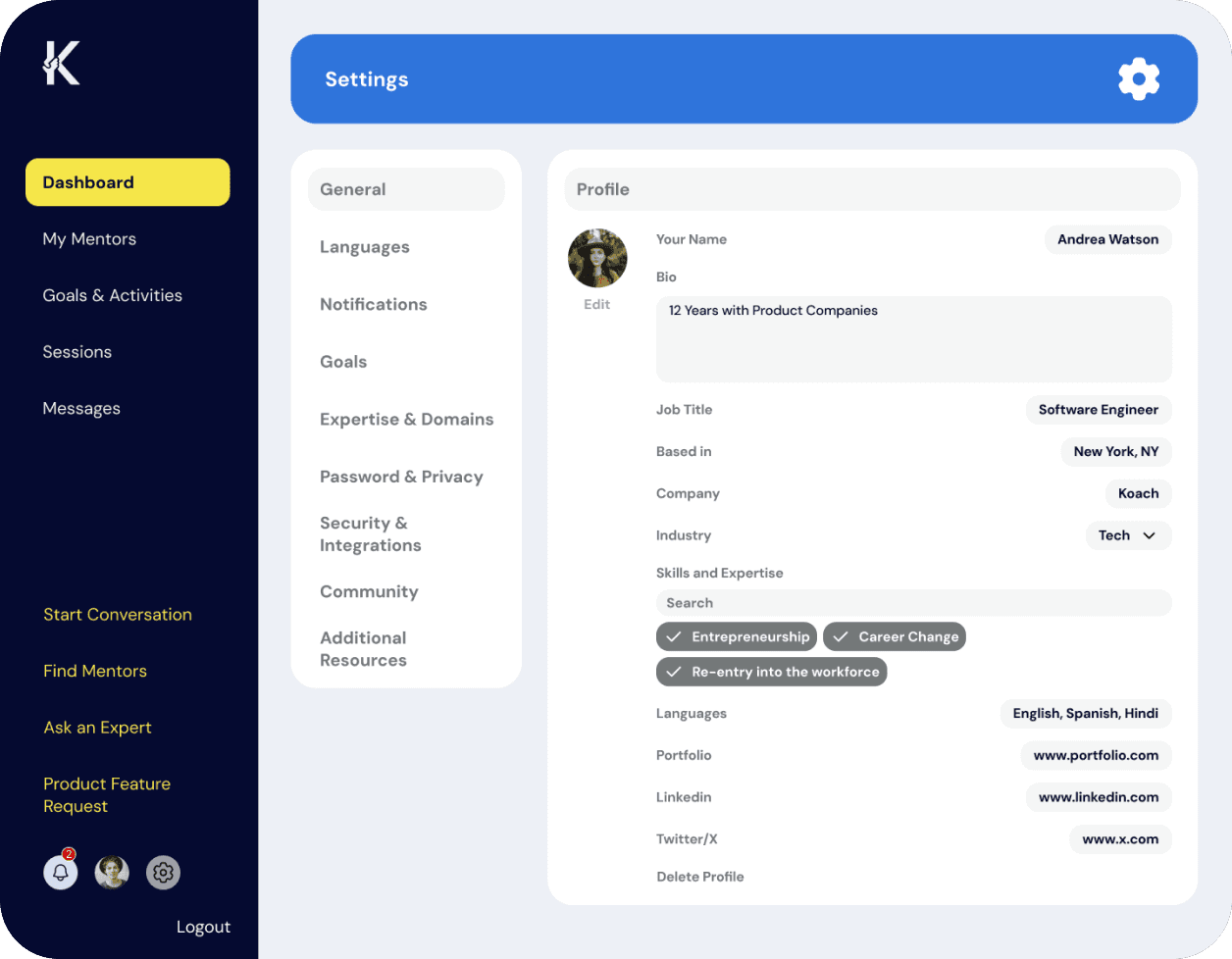
Design System and Component Library
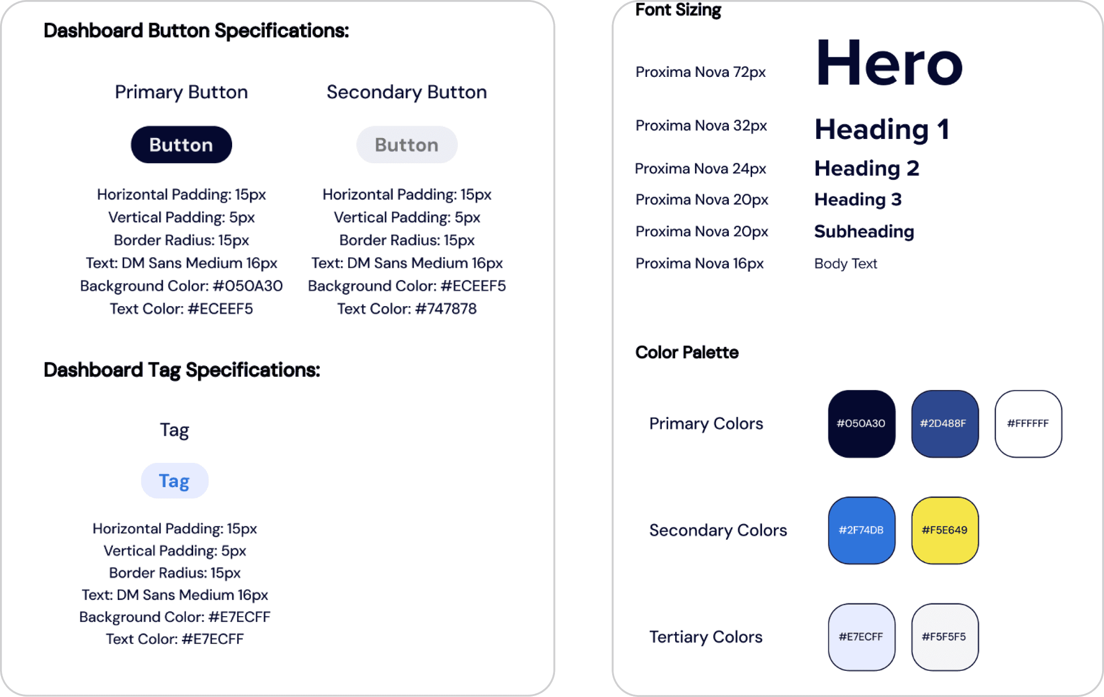
Design System and Component Library
Minimalistic feel while still using brand colors
Project Outcomes
The new matching flow turned user friction into successful connections. By redesigning the core search experience and building a scalable design system, we created an intuitive, consistent platform that users could navigate with confidence. This two-pronged approach paid off immediately, boosting successful matches by 10% while cutting engineering implementation time by 25%.
Takeaways and Next Steps
Conduct Usability Testing
Conduct user research: what do people need from a mentor/mentee finding platform